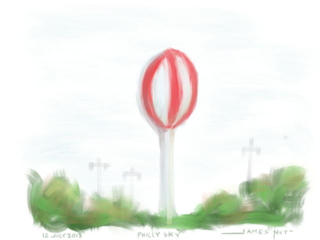
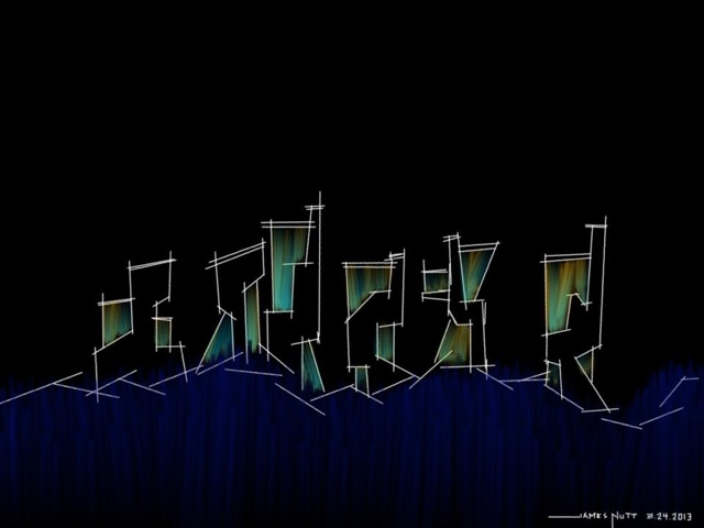
12 July 2013 - Daily Sketch - Funny Water Tower in Philly
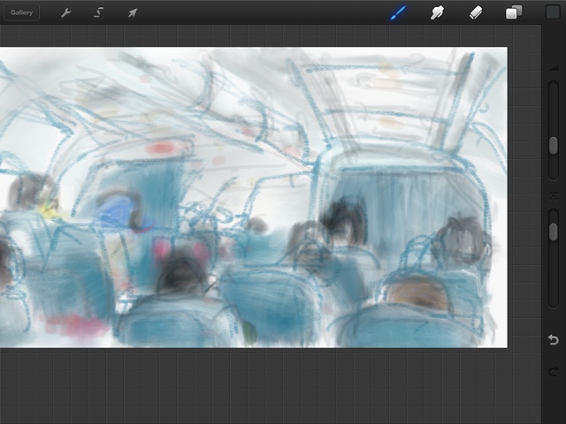
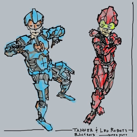
Turning boys into robots - iPad with Procreate photo trace
Happy 4th 2013
Today's sketch. Totally drawn and painted in the dark with everything balanced on my knee. I was only able to lay down 3min of pencil work before they shut the lights off for the fire works to start. I guess the nice part o my small kit are that you can remember where your colors are. I didn't know what this was going to look like until now. Gouache and fine marker.
Today's sketches
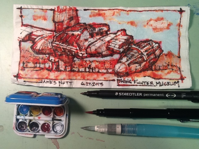
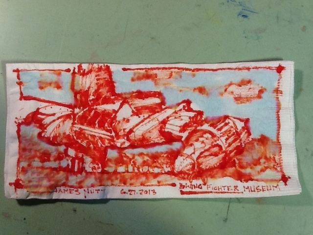
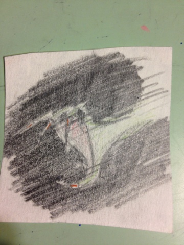
Napkin Sketch
Originally this was for a competition. I started it with Leo at a restaurant while looking at the same ship in a Lego magazine. I laid down the red first and the watercolor at Hazel's NE. I added the pen tonight. Then I read the competition instructions....ready,fire, aim. First it must be 5x5 square, then just ballpoint or ink, and the deal killer for me is you have to send the original in. They get 1,500 entries. I feel like I would be giving it away. It does get published in a huge trade magazine and the other prize is a printed stack of your napkins. I think I will find another use. I love it too much to give it away to live in some box.....or maybe I will send in a print...
Anyway... Here is the final and some process. I had a blast making this. Imagine another universe where x wings and other rebel force fighters are displayed like our WW2fighters....
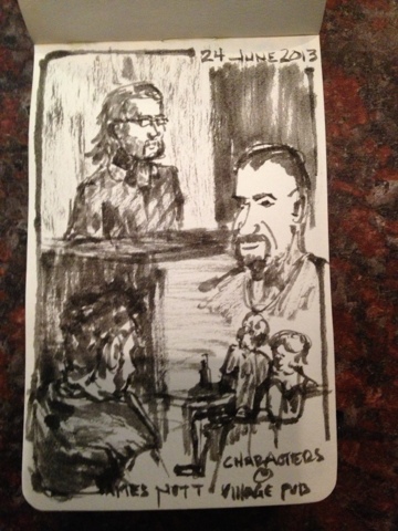
Sketch of the day at Village Pub
Some of the Hazel's wait staff made it it into the sketch! It is funny how you feel about a sketch a how much better others feel about it.
Sketching for Commision
I have recently responded to a call for artist to a local publication. I got a call back and a project! I don't want to say who yet out of superstition...
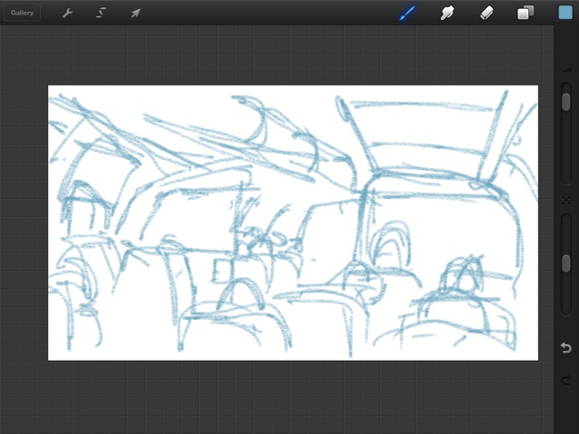
I am comfortable in a lot of mediums. However, given the potential exposure of this project I thought I would do an iPad sketch because of its uniqueness. My comfort zone is satisfied because of the ability to undo and really tweak things. I can also use this for future classes. My big picture reason for choosing this medium is because it is still somewhat rare to see published digital sketching.
Others have taken watercolor and graphite to unbelievable heights, but I feel like a pioneer in the tablet sketching arena. I have said before, there is no digital versus traditional. My iPad drawing makes me better with pencil. The ability to put color on a separate layer and undo makes me more confident in decision making which makes my watercolor better. My watercolor color studies make me better at selecting digital colors. So on and so forth...
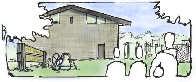
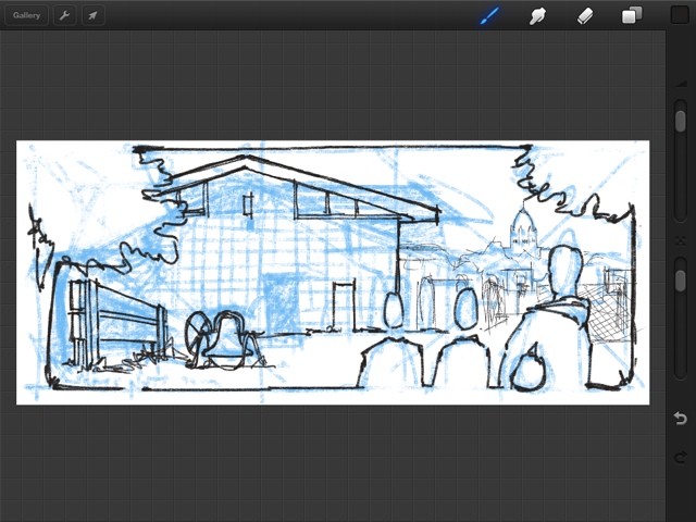
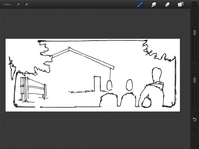
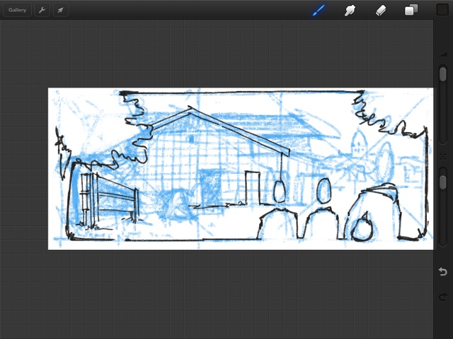
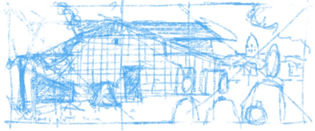
The following images are in reverse order from finished product all the way to warm up sketch. The "how do you do it" crowd may prefer this order. The linear minded may want to start from the bottom and come back to here. (actually, that may be the best way to read it and I will reverse it later from a proper computer))
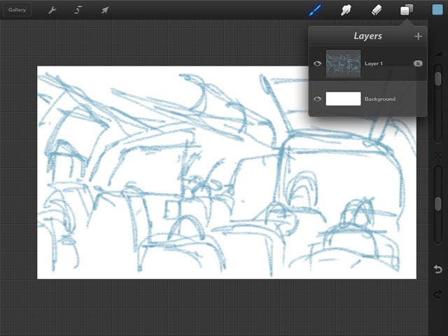
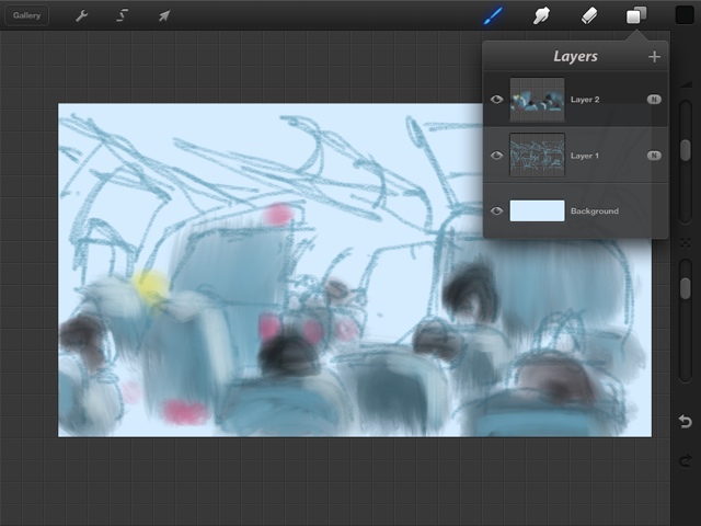
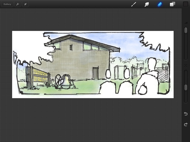
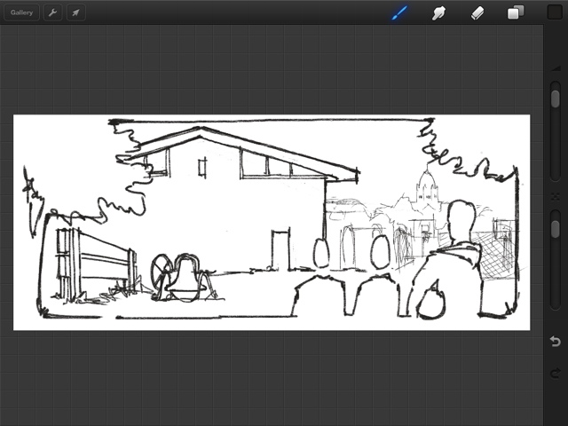
I have used the Procreate app for this drawing. A white background layer, a blue initial layout and proportion layer (later turned off), a border layer, a sketch layer, color layer, and a building texture layer.
The image below is "finished" or at least submitted. Looking at it today I needed a little red/orange somewhere.
Not a huge difference, but a little better.
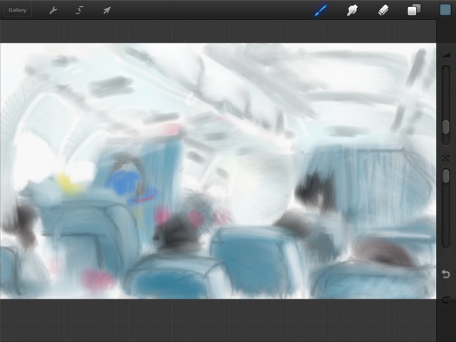
The almost final. I will look again tomorrow for a final proof before I send.
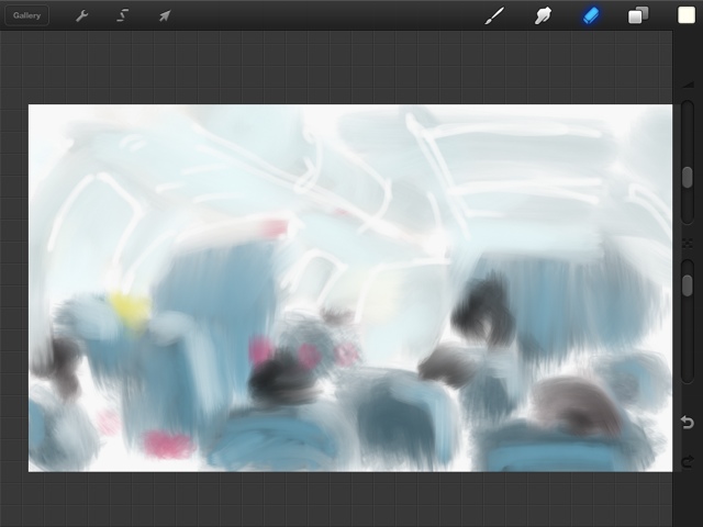
Smaller tweaks,fading out the background and thinking how to warm up the foreground colors.
I have the color on a separate layer. I should have taken more progress shots during this process. The whole thing is a little flat at this point.
Tweaks and tweaks
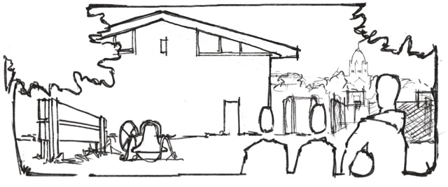
More sketching and fleshing out. Notice the cathedral. This can be seen from the other side of the street. I wanted to include it as part of the collage even though geographically it is incorrect . I later erased it because I thought being in the wrong place might bother folks and I really didn't have much negative space for the eye. It really wasn't a part of this story anyway.
To test the theory I turned the underlay sketch off
I had an idea for the border and where to lead the eye. I like to start from very big picture decision solidification and let smaller and smaller decisions land from there. Place the big rocks, then the medium rocks, and the little ones always fit correctly with the space left over. Everything from here was done on Sunday night from 9pm to 11:30pm.
Note the over use of the golden section for big picture layout. This always works for me and is how I start 70% of the time. Procreate gives you a default cinema option that I am in love with lately. This sketch was done at the coffee shop on Saturday. While I did think about it a lot, I didn't touch this again until Sunday night.
Photo underlay trace is a great option with this format, but I decided to skip that. Feeling and proportion were more important to the story than accuracy. Plus, honestly...this is a pretty boring building from the outside. Memories and purpose are what drive this building and not its architecture.
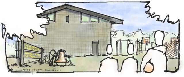
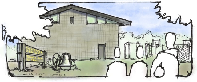
The gig was to sketch a location and make it relevant to a provided story. My story was a guy who directed activities and "owned" the gym for his time. He remarked on what the kids eventually became. The site was a little recreation center. There was no real vantage point that could tell the whole story so this is a collage. I drove around and took several pictures...and yes people were looking at me with suspicion.
Sketching in St Paul
Short Story - I have had a crazy week and Marcy started Father's day early and gave me an evening to sketch in St Paul. The back story is that I am entering a competition to be one of 3 artist to produce a sketch of lower town that will be on a beer coaster with a decent fee. I thought it would be great to spend a few hours there and sketch. I found this amazing park with a real piano that amazing people played. Also in both of my sketches, very bold people came and had great conversation with me. St Paul is awesome... period....
My view
A roughed out sketch
A bit more roughed out... enjoying amazing piano music
At one point the drawing "decided" it wanted both pages for a full spread layout
Three shots that need to be a panorama
Medium light roughed out. Also realizing I left my brush pen with warm grey ink at work. It was my intention to finish with this. At this point I decided this was a pencil sketch.
So now.. from left to right...tiime to commit and commit in the order that my hand won't smear the lead. Half observation half what the page needs for composition. Lots of decisions here....lots of oportunity for lazyiness...
"finished" is a relative term...out of time
Sketch in context
I drove past the depot and it obviously needs to be sketched, but I wanted to be warmed up.
Panorama is a good representative of my view
In context
Pretty proud of this sketch. Pentel Brush Pen loaded (via syringe) with Noodlers Cayenne ink. This sketch was probably about 25 minutes not counted conversations. I am pretty proud of this one.
I ENJOYED THE EVENING BIG TIME... I hope you enjoyed the sketches. Just keep drawing!
JNutt
Sketching at work
People think architects draw all the time. It is not true, but sometimes it is true. I take every opportunity I can to draw instead of talk. One reason .... I draw better than I talk...especially if I have been "in my head" for a while. This is an example of my favorite type of work drawing. This drawing is literally drawn at a one to one scale - meaning life size.
I learned to draw this way working at a design build firm where every thing was crazy fast. I needed to develop something the developer and owner could see what it looked like, the construction could understand how to build it and in what sequence, and the architecture team could turn it into details.
I envision....someday... of an entire set of construction documents with one plan, one reflected ceiling plan, and everything else is drawn this way.
Notice this paper is on a grid, but an axon grid. This is a trick learned from the great Jim Larson - detailer/poet/ sage exemplar.
Travel water color kit - Second Generation
Travel water color kit - Second Generation
Some time ago I blogged about how I made my first water color travel kit with a mint tin. The first was a Newman's own because Altoids started embossing the label. I have really enjoyed the kit and have used it several times a week. 80% of the water color you see on my blog comes from this kit.
At Christmas my wife got me a perfectly sized bag for my travel stuff. I guess it is a baggalini. She thought it was masculine enough with all of its zippers. I am a 6'5" 260# guy so I am also good with it. The size is perfect but I catch myself putting too much into it. One of the happy accidents of my first water color kit was making palettes removable so they can be swapped out. These extras fill the bag up. I also have a few kids kits with high quality water color and gauche swapped out. Basically I have really filled this bag up. So it is time to make a larger travel tin that holds all of the colors I use for the bag. I will still keep the original for lighter travel.
The well loved original
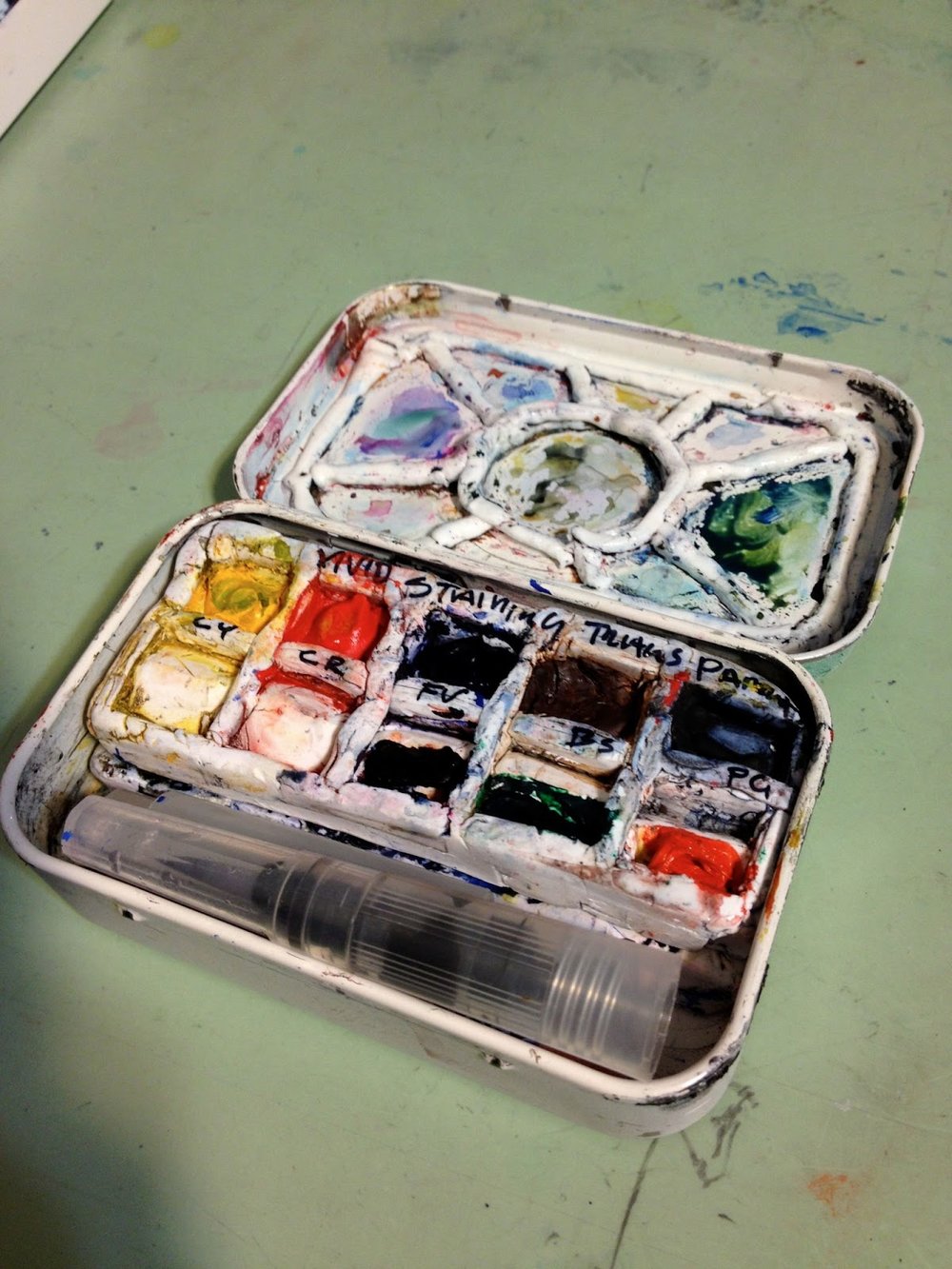
The first generation kit closed. Typically I have a rubberband around this and a paper towel. Although I followed the rules on the appliance paint plus a few extra precautions, the paint is still coming off. This is ok as I love the worn look.
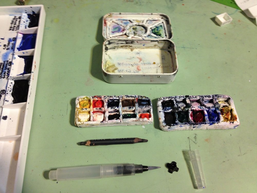
Open kit with 2 trays, the mini water brush (thanks Wet Paint! They now carry these but ordered them for me) and a short double sharpened pencil.
Open kit with everything laid out. Notice the pencil is carved flat on one side so it doesn't roll away.
However, I have accumulated other palettes and tools and it takes up too much room in my bag.
With my portable kit I have room for a small waterbrush and a pencil. This is perfect all in one for the pocket. However, with my bag I always have room for the larger brush and better pencils and pens so I have decided to make a slightly larger kit based on my complete home "Making Color Sing" Palette. Currently I have the same palette on 3 seperate trays but the kit only carries two. The rest are in my bag and mostly unused. See above.
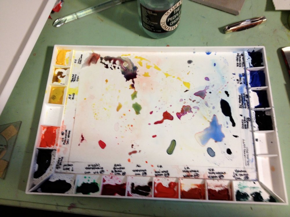
My home palette on a John Pike tray I am trying to replicate.
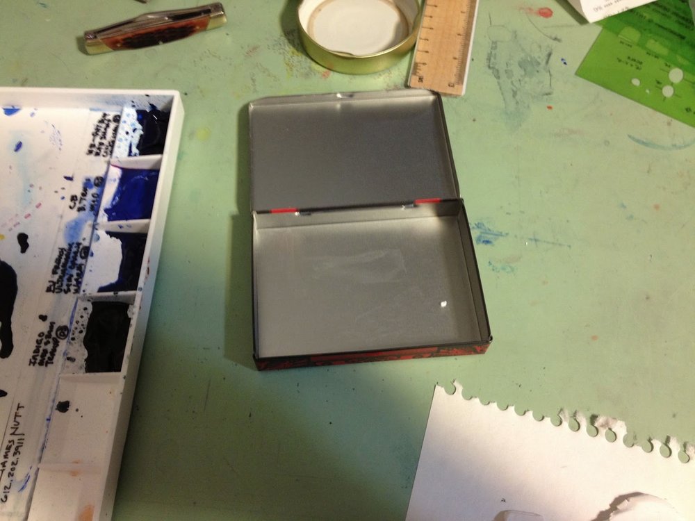
I found a perfect tin at a record store ( the electric fetus - old fashion music store with tons of cool stuff that I often find goofy gifts for Marcy - I found this tin doing Mother's Day shopping for her)
They only had a few to choose from. The "Poisen" them seemed cool enough and way more relevant than the other selections. The size however, is perfect.
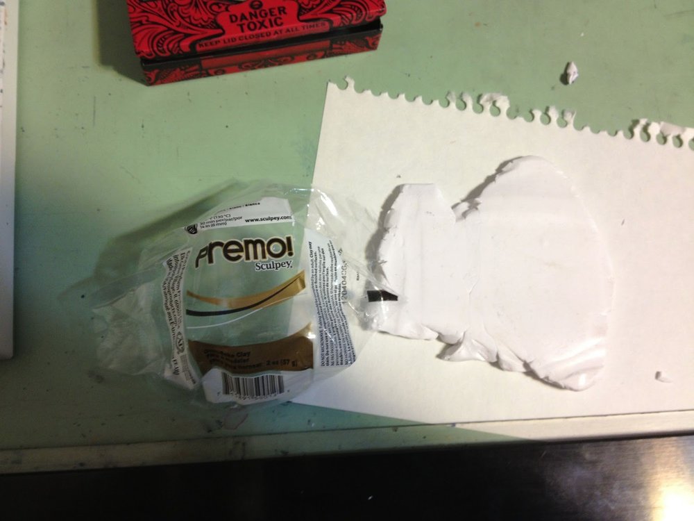
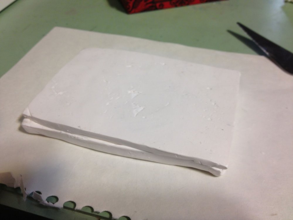
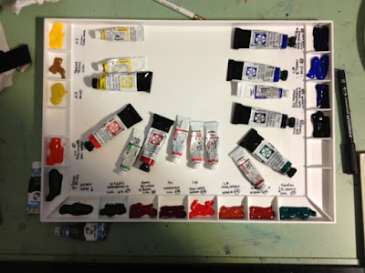
For this round I made half pan holes and no place for mixing. I found I just didn't use the spaces in the first round to mix colors with as much as I thought. I mainly use the lids flat surface. In this round I used two full sculpey clay packs and used the small left over to make a very thin mixing surface. It is cooling right now and we will see if it stays flat. Everything is an experiment so we will see!
Progress shots
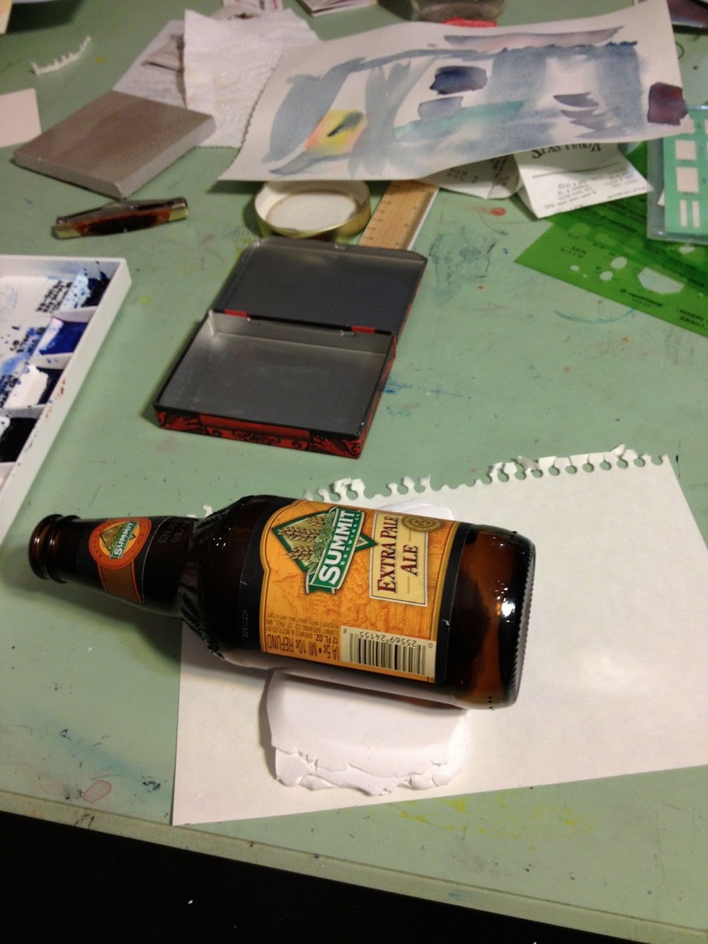
I roll the clay out using what is handy.
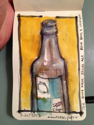
This time it happened to be a Summit beer bottle. I also found by accident that summit has an embossed logo on the glass. I used this on the back just for fun.
Sizing and cutting the first "slab" to fit while being removable.
First I make impressions with a half pan of water color and then cut all the way through.
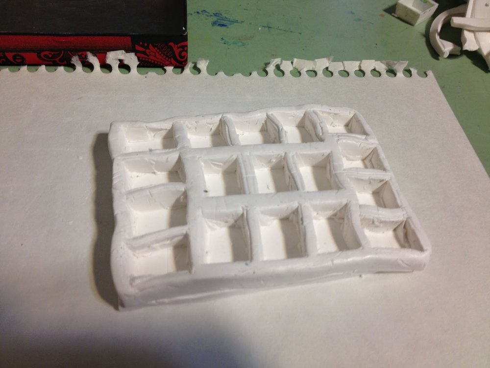
My original intention was to leave a mixing portion in the center, but I was unhappy with the number of color choices given my goal is to replicate my home studio palette. I cut the pans all the way through. On the first round I tried to dig them out and keep a constant backer depth. This was sloppy and inconsistant and caused curling in the cooling process. See the left over pieces in the top right? This time I am making 2 slabs for more consistency.
Rolling out the bottom slab.
Notice that I put the left over plugs back in and reorganized my holes to get the number I needed. At this point I have pressed the top slab to the bottom slab.
This shows both slabs upside down.
Trimming the sides to be sure everything fits
I also rolled the Summit label into the back. We will see if that survives the oven process.
With left over sculpey I am making a very thin paint mixing surface that will fit with the lid closed. I hope this doesn't buckle.
One last test fit before the oven
On last test fit of the paint mixing surface and pressed my name in for fun.
It does close at this point. I hope nothing buckles in the oven. If it does, a rubberband will save the day.
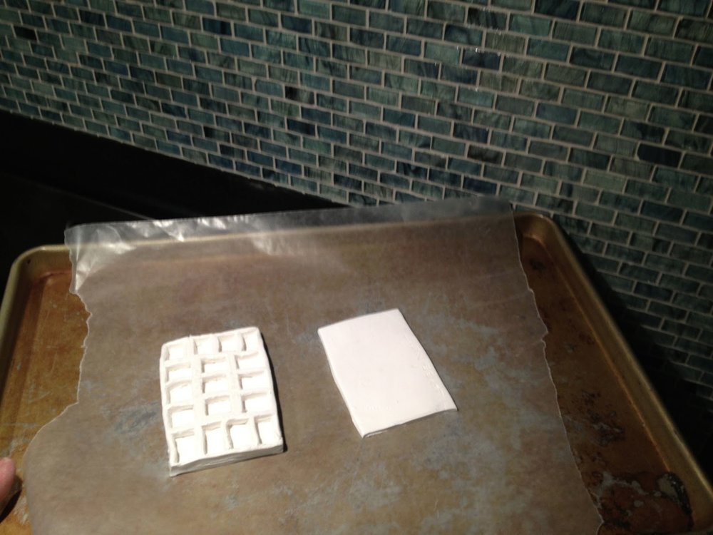
Ready for the heat
275 for 30 minutes
Time is up! (yes blogging this while it cooks).
Everything came off the wax paper just fine
The main tray doesn't really show any bowing at all. I was careful to keep things the same thickness and depth. The cover tray shows a little curling during curing but still seems really flexible. I will need a rubber band, but now looking close the lid really doesn't secure itself very tightly even when empty. The rubber band is really handy anyway and I usually keep a paper towel for the water brush anyway.
"Cooked" tray in place. It comes out easy too! (My first generation did this by accident, but with coaxing) I had counted on a little shrinkage, but not much.
Closed kit, now where are my paint tubes? Let's put this sucker to work! I may eventually paint the inside white to use as mixing surface, but that is another night!
I hope this was interesting. I certainly enjoyed making it with the thought of sharing.
(I will add the color process on another post as I am sure this one is long enough)
Keep drawing and painting! Scratch that deep itch!
James Nutt
Sketching in Savannah
I had the privilege of a business trip to Savannah. Although packed with meetings I did bring my sketch kit and got a few sketches in.
My week started in Philly and I wound up in Savannah late that evening. Although tired, I knew this was my opportunity to roam by myself.
First night - Sketch one
This is a sketch of a cool underground restaurant. It was mostly dark and there was comedy going on with lots of back light. I knew the first sketch is never great, but you have to start somewhere. Watercolor in dark seems to be a theme here lately. Maybe because I my free time is in the evening.
Sketch Two
I found a bar with a rooftop patio around 12:30 am. I was very tired and the first drawing was too large to start with. I enjoyed it, but was pretty unhappy with the outcome, but as I get more distance I like it more. I may go back and selectively kick up some of the line work. Almost all of these are painted in the relative dark meaning I am painting on memory of my palette. I have come to enjoy this because the next day you get to see what happens and it is a bit more spontaneous than if I had full control. Let that be a lesson on looseness!
I could stop on that one so I brought out my Pentel brush pen. I have recently "manually filled" the cartridge it came with using Noodler's Ink Lexington Grey. It hasn't yet overtaken the black, but I am patient. I really enjoyed this painting and was even happier with the color the next day. However, it was getting very late by now so I walked back to the hotel.
Second Night - two quick sketches while with clients.
The meetings went very well and we all roamed the streets that evening. While we stopped I was able to get two sketches. The first is unfinished as we moved on faster than I thought we would and the second was during dinner waiting on the food. Yet another watercolor at night exercise.
Day Three, for a while the last day, this was my office.
Great trip, great people, great food, I love travel.
Draw to remember, beauty will come
James Nutt
Sketching on Mother's Day
Sketching on Mother's Day with Marcy and Leo at Lake Silverwood. Medium - moleskine watercolor paper, an old felt pen running out of juice, spilled coffee to keep the pen going, water from my travel brush, and a tiny bit of red and yellow watercolor.
This last one was very quick using a brush pen and a small amount of water color. Probably about 3" by 3"
Beautiful day and a long walk of stick sword fitting "bad guys" around the lake.
James Nutt
Twin cities Nicc Ave Urban Sketch
I haven't gotten the chance to do as much Urban Sketching lately. Today I had to wait to get an appointment and used some of the time (in between work phone calls and emails) to sketch from the great window of the Minneapolis downtown Barnes and Noble café.
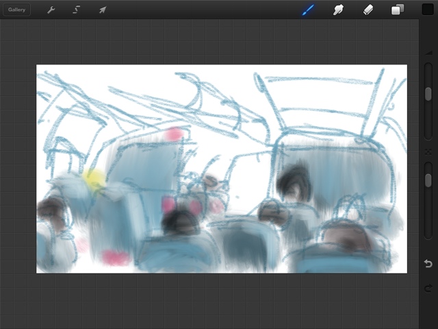
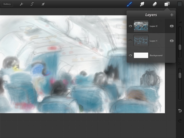
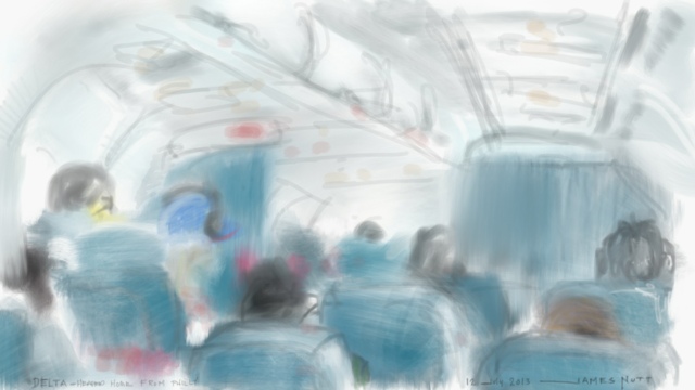
This is an iPad sketch using the ArtStudio app.
As you can see, while springtime is here, so are the jackets, hoods and hats!
Minnesotans apparently aren't allowed eat the last of anything
IPad Drawings
Speaking at Open Book to the MCBA on the artistic medium of the iPad
I had the privilege of speaking to a great group of MCBA artist at Open Book in Downtown MPLS on Monday night. I thought I would share the description below. I was surprised to see other people blog about the event afterward and have included those links and encourage you to look around their interesting sites. The http://www.orangespiralarts.com/my-blog/2013/03/mcba-visual-journal-collective-gets-digital.html has photos of the event.
"Urban Sketcher James Nutt is going to be speaking and demonstrating digital sketching on the iPad at the Monday meeting of the MCBA Visual Journal Collective on March 18th at 7:00 pm.
You can read the details at the link below.
The meeting is free and open to all adult journal artists. http://rozwoundup.typepad.com/
The referenced blog is by the amazingly talented Roz Stendahl. Her blog is an amazing resource for art technique, book making, painting, paper, sketching, and so much more. We encourage you to look around and possibly learn a little more about the MCBA Visual Journal Collective.
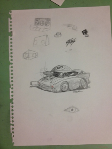
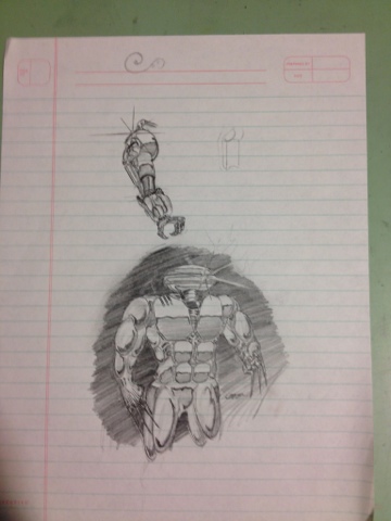
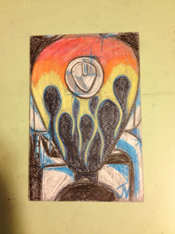
My High School Drawings!
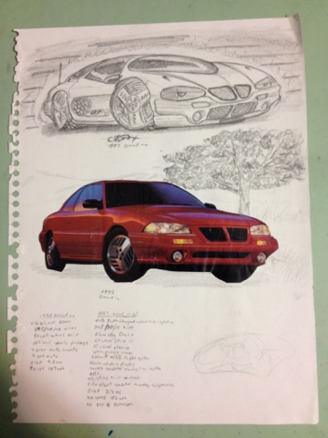
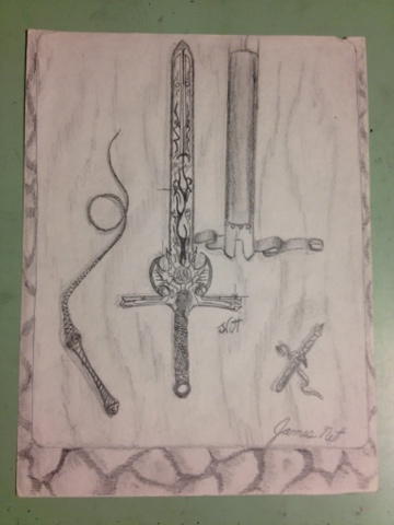
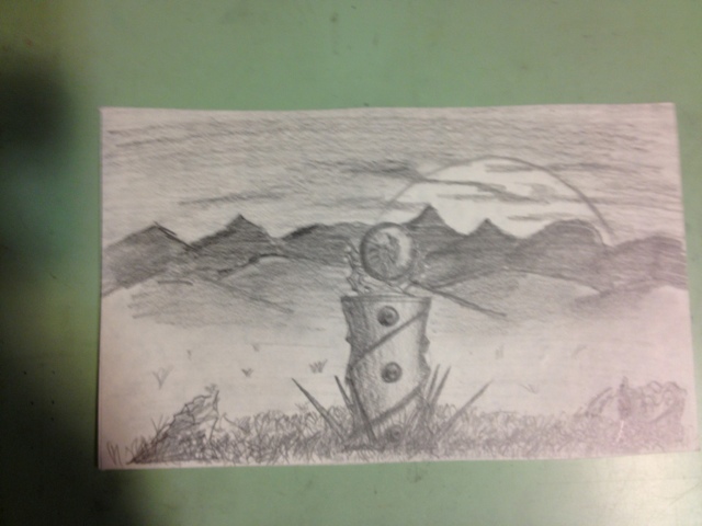
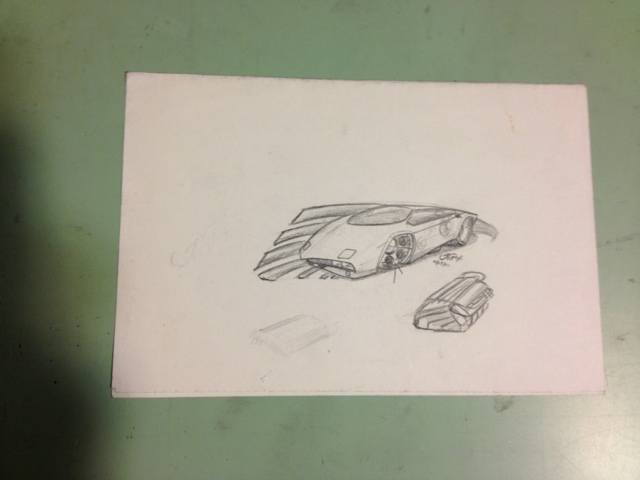
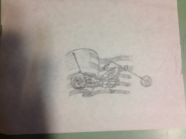
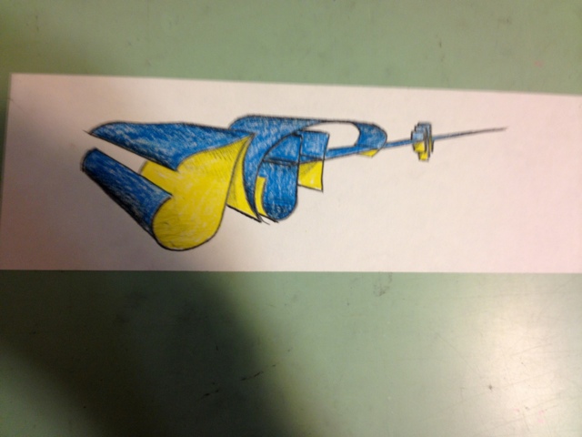
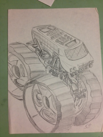
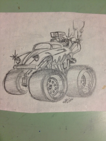
I found my old folder of drawings. Anyone who sat next to me in any class probably saw something like this! What a blast to see these again. I can almost remember exactly what I was doing while drawing each of them. Perhaps this is why I didn't graduate higher in my class but did pretty well in Architecture school. My favorite themes were to take current cars and guess the future design, Dragons and the like, landscapes, etc. Teenage boy stuff I guess... I wish I had dated all of these, but this is junior high and high school.
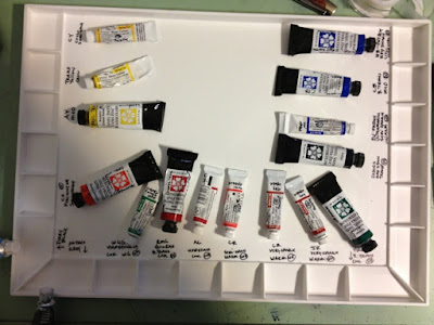
Laying out my John Pike palette with watercolor
My process of over thinking laying out a watercolor palate.
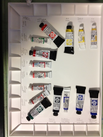
This is the final result
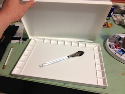
The new palatte. A John Pike from amazon via a gift card from my parents. The awesome brush as well.
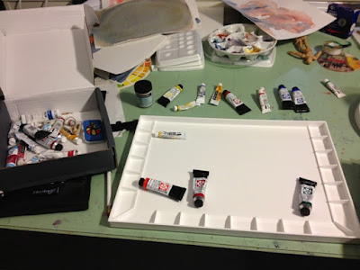
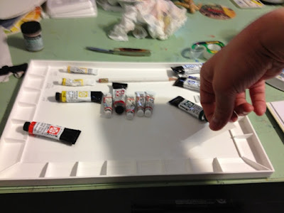
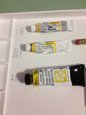
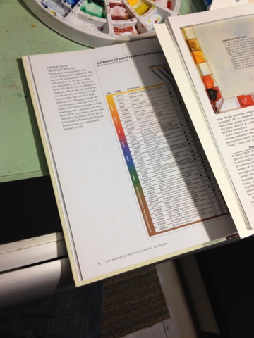
First to pick the colors. I decided to use advice from Making Colors Sing and The Complete Watercolorist's Notebook. I worked to separate the primaries and separate them by cool to warm consistantly on each. I do this because I am still working on my eye to distinguish the difference.
I put regular tape down first so I could write on the tape. Later I will rewrite with a marker and cover with another piece of tape to protect from the water.
I am interested in knowing and training my eye for 3 things. Cool to warm, transparent or staining, and of course the name and brand of each to replenish later.
Loosely basing the decisions on the two books mentioned before on advice about warm and cool, trans and staining, and how to seperate
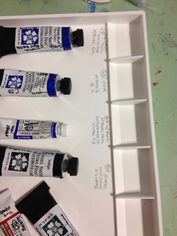
Basic layout and verbiage
Close up of the blues with the basic info
I go over the pencil with a pen. I don't erase the pencil because I am too lazy to clean out the little bits of erasure and I am ok at tracing over the older lead.
Once done, I put a second piece of tape to seal it and start the fun part of squeezing out the tape.
The finished product. Now....to paint. Hopefully this was helpful. I didn't see anything this clear so I thought I would create it. I am sure there are things I will learn, but this is something I can work with for a while! Everything I have is based on travel kits, this is my first at home studio kit. This palette comes with a cover. Very cool. Thanks for looking!
JNUTT
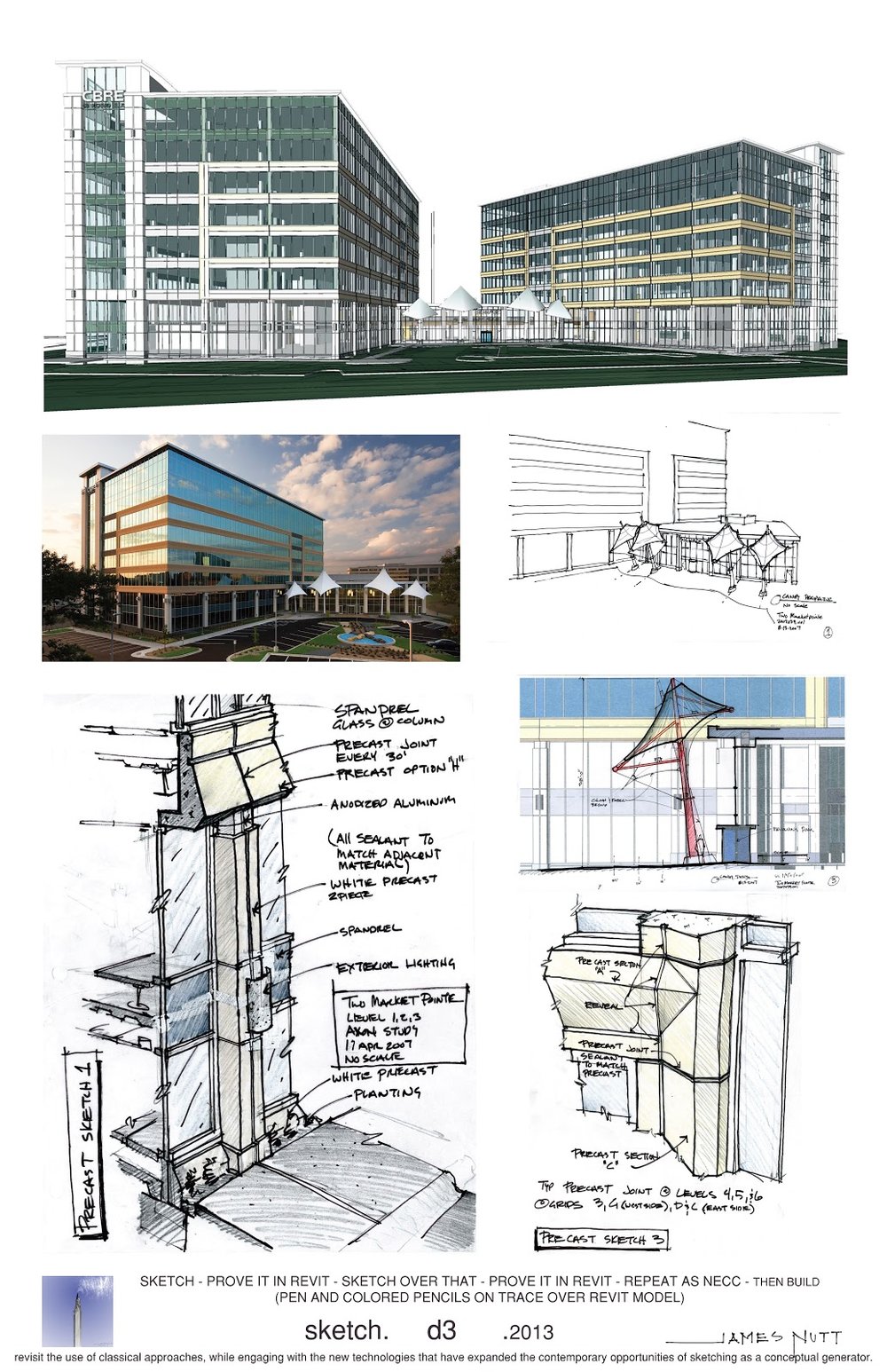
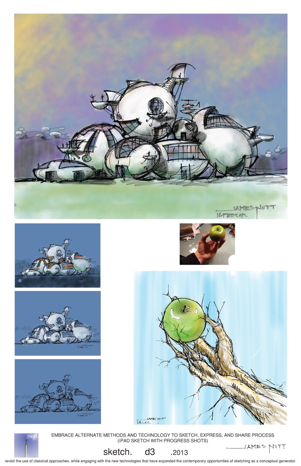
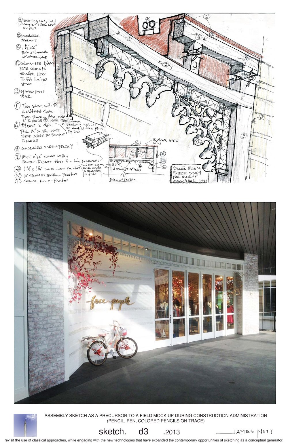
D3 Sketch Competition Board 1
BTW - WAS CONTACTED THAT AT LEAST ONE OF THESE (MAYBE MORE) WAS SELECTED AND DISPLAYED OUT OF OVER 1,500 ENTRIES!!
I recently submitted 5 boards to a call for art/competition with the theme of sketchings role in the world today. Or at least that is the part I latched onto. I broke the way I use sketching into 5 distinct roles. This first board is about how I sketch when I travel to remember, record, or just sit there and try to listen to what the architect is trying to say. I am active in the Urban Sketchers community lately but these sketches range from 1999 on the top left to 2013. I will post the others seperatley but they cover. Sketching for work. Sketching on the Ipad (new medium), Sketching through a design process, and using 3d modeling to design with and tell multiple stories (aesthetic and techincal).
I hope you enjoy. It was fun to categorize these and think about how we use sketches today.
3.1.2013 - I decided to place all of this into one post
