(I am overdue in posting this. I am well into using this palette and have been evolving the colors already. I keep meaning to add more details into the blog, but I think the photos speak for themselves and I am going to go ahead and publish. More to come on the actual colors etc as I settle into them. So far really enjoying the kit.)
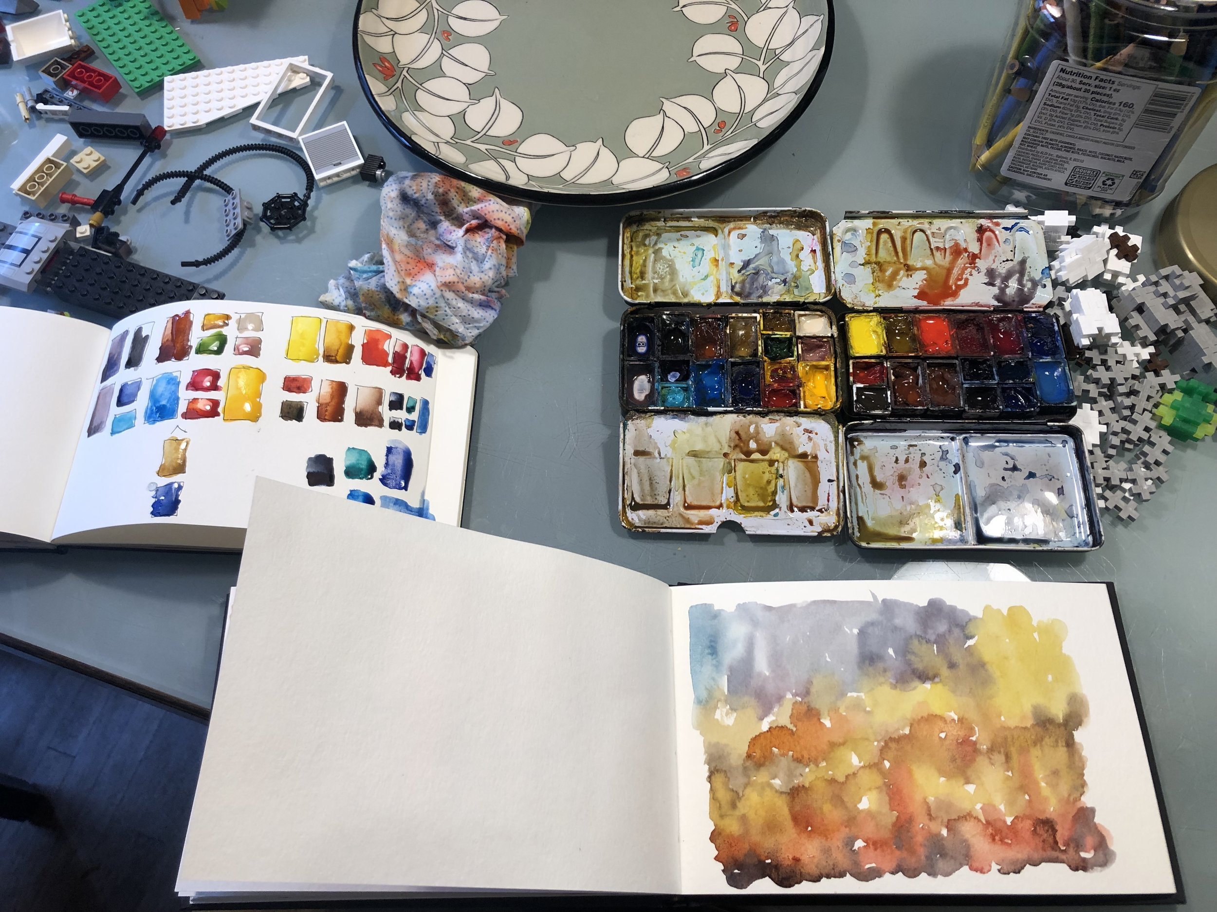
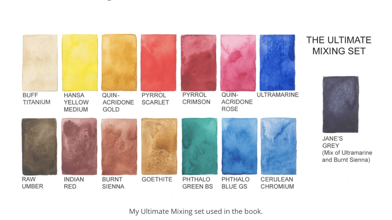
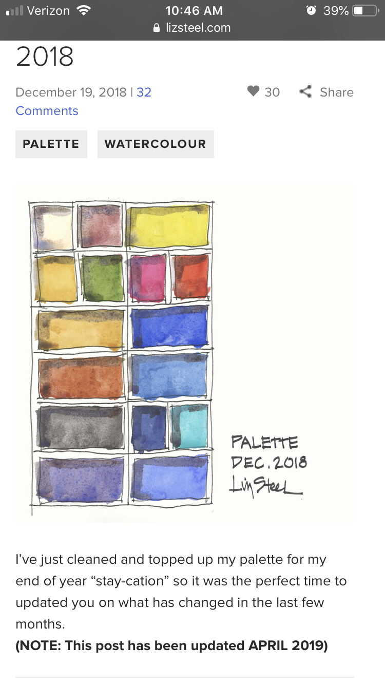
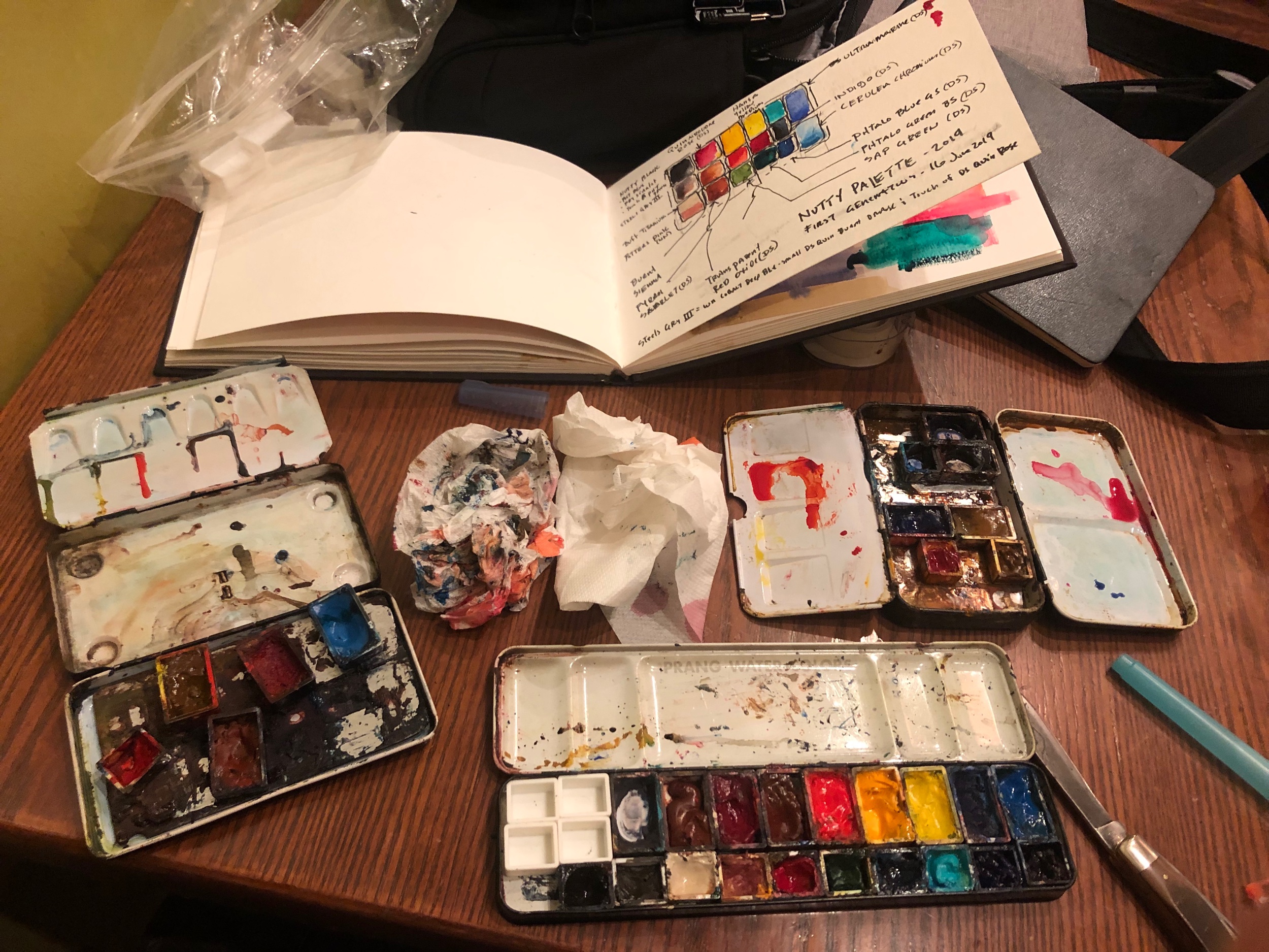
THe about image are the two kits I have been carrying and using for about 4 years. Maybe three. I am tired of carrying both. Each is based off of color palettes put together and posted on line. The left is the more recent (only 2 years using) from Liz Steele and the kit on the right I have used forever and it is Jane Blundell’s ultimate mixing palette. I am at a point where I want to develop my own but I am using ideas out of both of these (and how I use them).
This is a a prelim thought on what to keep, what to merge, and a general layout that might work.
The above image is the ultimate mixing colors taken from the web. This is based on triads. Which is how I paint, but in the moment I could never remember which was which, but I developed my own strategies and favorites. If you want to start with a real water color kit….this is a truly excellent basis.
I love Liz Steele’s work (an architect turned full time artist) and it took me a while to get used to this one but really love and have kept some most of the colors. She constantly updates and experiments and posts her choices. So cool.
More studies trying to get these to fit into one palette.
I bought this antique palette at a flea market in SW Missouri. I am going to use it. These other two tins have literally travelled the world with me and I will likely use them again.
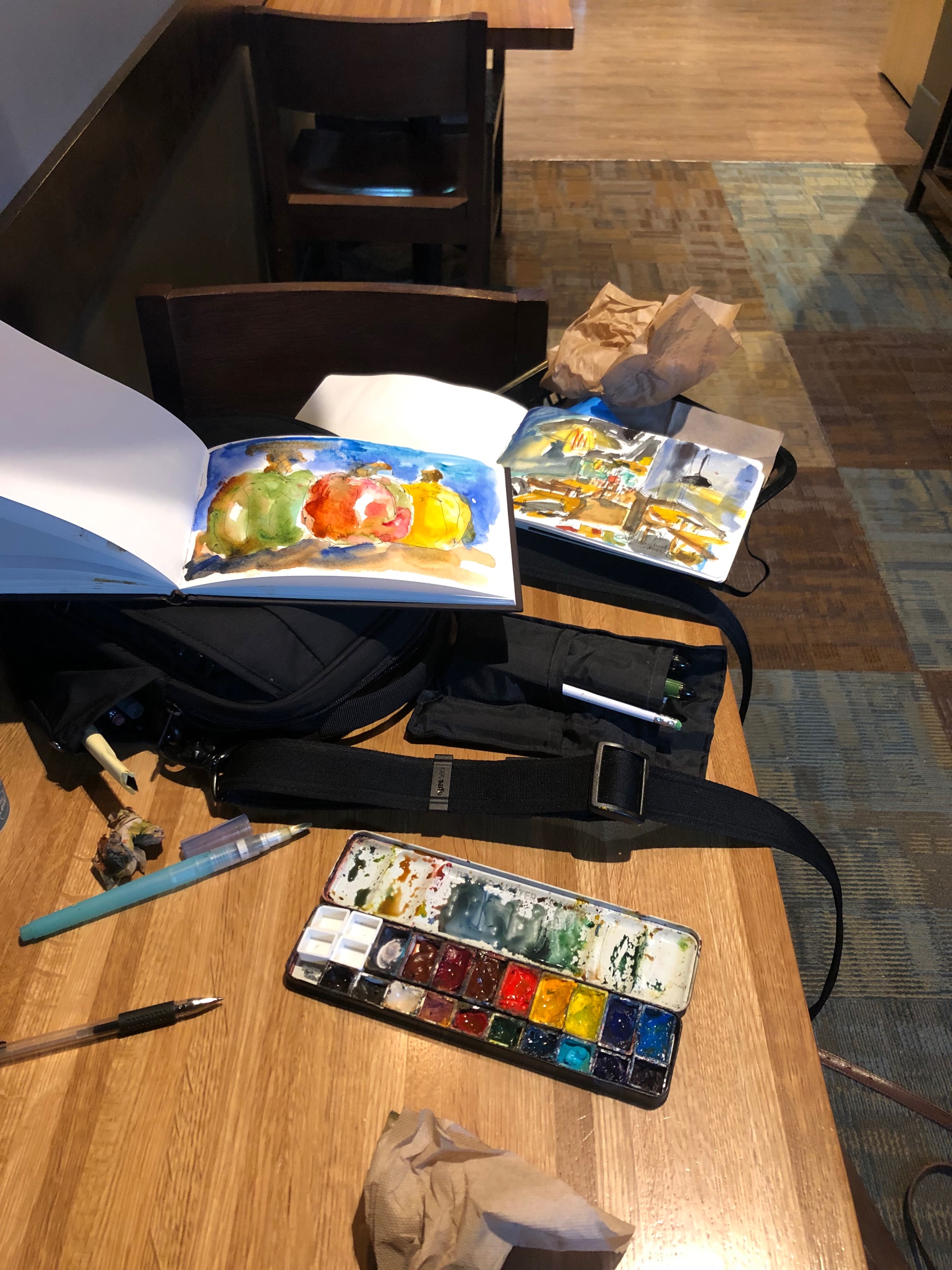
The rest of these images are at the NE Coffee shop, late in the evening, where I am reassembling the colors I decided to use.
This triple row was a great idea but just a little to wide to let the lid close.
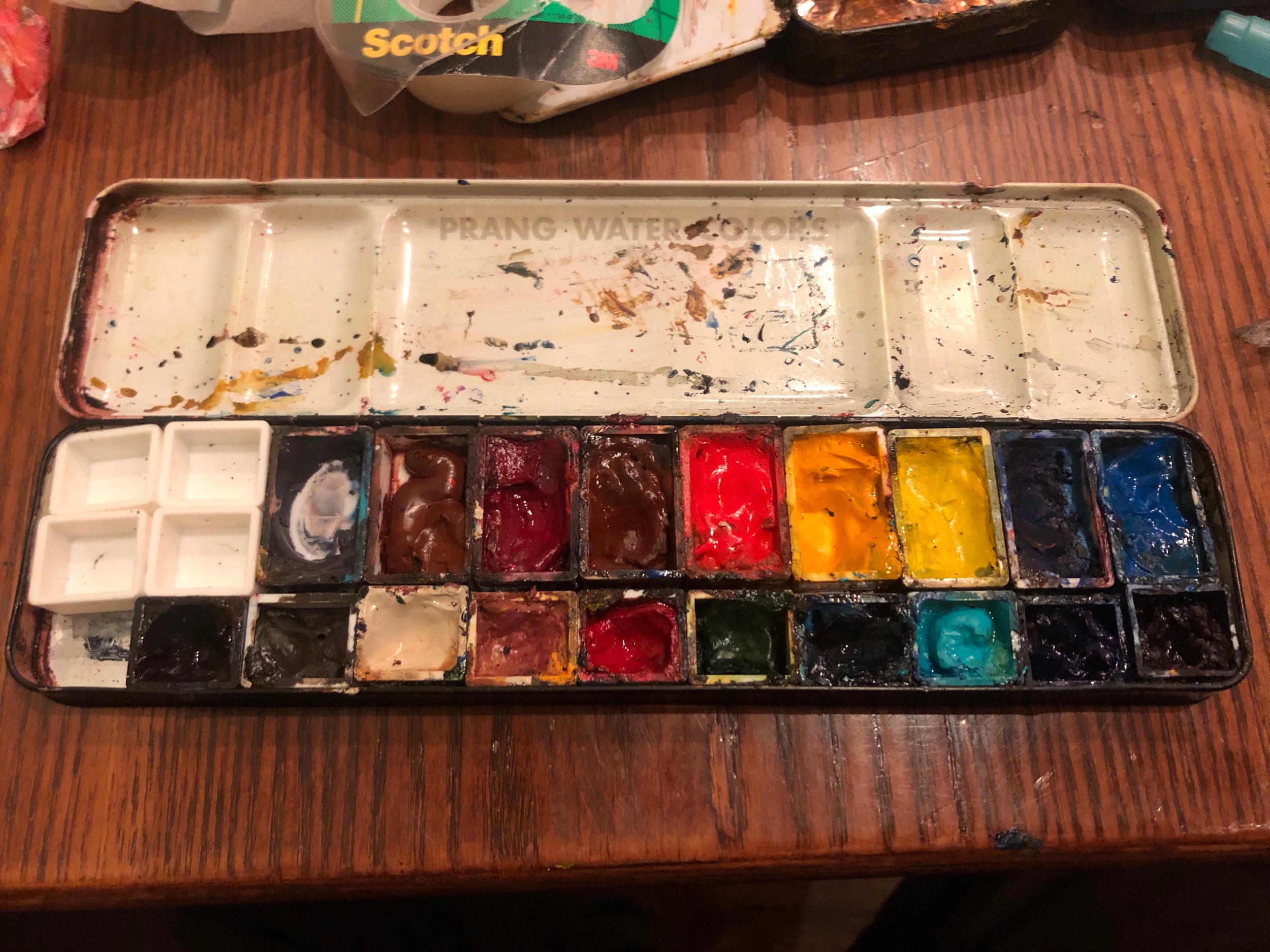
Things have evolved since this picture but this is essentially the layout I am using now.
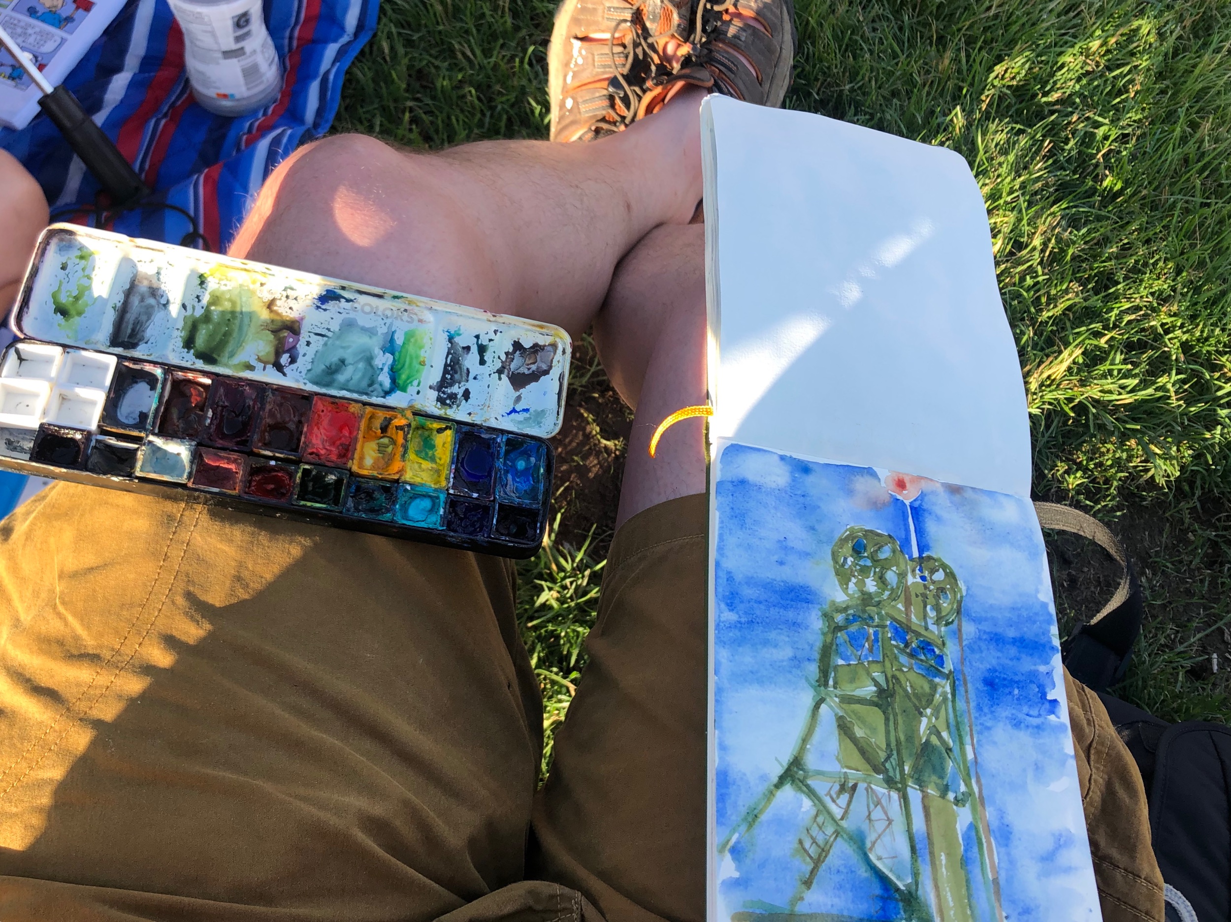
Pictures from the first few test drives!
Hope you enjoyed this. It has been fun. Much respect to the artist who already have their own colors picked out.. It is intimidating. I have only ever used Daniel Smith, mainly because I choose the first mixing palette in combination with loving the Making Colors Sing book (she also suggested Daniel Smith). I love the colors and for me it limits the choices (which is still a ton of choice…too much)
I hope to keep updating and will do a color layout soon.
